Reelic · Case study
Thanks for Visiting
Reach out
Context
The short version · ~15 min read
You saved a few thousand reels. Can you find the one you need?
The problem was never saving. That is one tap and it always works. It is looking: a few thousand saves sit in a folder with no search box over it.
My process went from research to 4 decisions, 3 of them harder on purpose, and ended on indexing them in your own browser. The output is a folder that answers from whatever you happen to remember, on Instagram, in a side panel or in a dashboard, live at 1.0.5 across 6 browsers. The outcome is small so far: weeks live and about 10 people using it, because I built the product before I built any way to find it.
- 10+
- Beta testers so far, before any announcement
- 93+
- Every component, state and icons designed
- 2 weeks
- From idea to product
02
Background and process
From Concept to Deployment
It started in a notes file with my own saved folder as the problem, and ended on the Chrome Web Store. The marks above are every tool that touched it.
The process, in 15 steps
Open the at the top of the screen to jump between steps at any time.
Problem
Research, insights and personas
03
Problem statement
Saving is not the broken part. That is one tap, and it always works.
Looking is. A few thousand saves sit in one folder with no search box over it, so the only way back to something is to scroll until you see it again, carrying whatever you happen to remember.
04
Research
5 interviews first, then desk research: why people save, and why they never come back.
5 interviews
Saved reels go unused because people can't find them. Rather than scroll back, they search Reddit and the like.
My interviews
Just in case
1 of 5 reasons people give for not deleting digital things, in a study of 45 adults aged 20 to 52.
- Just in case
- As evidence
- Takes too long
- Attachment
- Not my problem
Fear of losing it
Dr Era Dutta, consultant psychiatrist and founder of Mind Wellness
“There's a deep-seated fear that if I don't save this now, I'll never find it again.”
36%
Of 5,000+ Firefox users surveyed, 73% knew how to bookmark from the Bookmarks menu. Only 36% actually use it.
05
Key insights
01
Saving is a reflex
People save to stop worrying about losing something, not to come back to it. The tap is the whole job.
02
Memory is a fragment
Nobody remembers a title. They remember a word from the caption, who posted it, or roughly when.
03
Upkeep goes unused
Tools that need sorting, like bookmark menus and folders, sit unused even when people know they exist.
04
Saves are private
A saved folder says a lot about a person. A tool reading it has to earn that before it reads a thing.
06
Personas
Proto-personas, built from the research and from who Reelic's features serve. Composites, not real people.
- Recipes
- Kitchen hacks
- Goal
- Cook the paneer dish she saved last spring, tonight.
- Frustration
- Hundreds of food reels look the same in a grid.
Reelic for themSearch by an ingredient in the caption
- Hooks
- Trends
- Edits
- Goal
- See which creators and hashtags he keeps learning from.
- Frustration
- His saves are research with no way to read them as a whole.
Reelic for themTop creators, hashtags and the network graph
- Tutorials
- Design tips
- Goal
- Get back to a tutorial when she only remembers who made it.
- Frustration
- She forgot the words, but not the creator or the month.
Reelic for themFilter by creator, hashtag and time range
07
How might we
How might we let people find any saved reel from whatever fragment they remember, without asking them to sort anything or hand over their data?
Process
Requirements to iteration
08
Design requirements
Each insight became something the design had to do. The 4 decisions further down are how each one got met.
09
IA and user flow
Where everything lives first: Reelic's 3 surfaces, what sits in each, and the 1 index they all read. Then the 2 flows that matter: the first sync, and Maya finding her tutorial.
Information architecture
- Start
- Action or screen
- Decision
- Done
- Loop back
First sync
Maya's search
10
Design decisions
There is no API for the thing I needed, so every one of these was a trade. 3 of the 4 made the build harder on purpose.
Where the index lives
Not taken
On a server
Let AI sort everything
A phone app
Shipped
On your own machine
How I got there
I started from what I would need to believe before installing this myself: that nobody else can read the folder.
What it cost
- User
- No phone version, and nothing syncs.
- Technical
- Search, storage and charts all run in a tab.
- Business
- No accounts, so no list and no retention data.
How the saves get collected
Not taken
Scroll the whole grid
Shipped
Ask for them directly
How I got there
The first build scrolled the page and read whatever loaded. It was slow, it broke every time Instagram changed, and I threw it away.
What it cost
- User
- The first sync still takes minutes.
- Technical
- A full rebuild, inside a page that blocks scripts.
- Business
- It rests on an address Instagram never promised.
Where the search should sit
Not taken
One dashboard
Shipped
3 surfaces, 1 index
How I got there
The dashboard was built first and it was the wrong place to start. Nobody leaves Instagram to search Instagram.
What it cost
- User
- 3 places to learn rather than 1.
- Technical
- 3 interfaces and 3 sets of states, solo.
- Business
- 3 surfaces to fix every time Instagram moves.
What the first sync says
Not taken
A spinner
Sync quietly, ping when done
Shipped
A live count
How I got there
This one is not a win. The first sync is slow, and showing it makes the worst moment of the product the first one you see.
What it cost
- User
- You watch a slow job instead of being distracted.
- Technical
- Search has to answer from a half built index.
- Business
- The riskiest minutes of a new install are visible.
11
Evaluation
Tested against 10 heuristics
Before a usability study, a review against Nielsen's 10 usability heuristics.
6 met · 4 partly
Visibility of system status
Live count, a 5 to 30 minute estimate, a done message.
Match with the real world
Search with what you remember: caption, hashtag, creator.
User control and freedom
Escape closes, filters clear, a stopped sync resumes.
Consistency and standards
3 surfaces, 1 index, 1 design system.
Error prevention
A 3 letter minimum, but early searches read half an index.
Recognition over recall
Filters list creators to pick; search still needs memory.
Flexibility and efficiency
Sort and time range help; no keyboard shortcuts.
Minimalist design
Sits inside Instagram; charts explain in tooltips.
Recovering from errors
Rate limits retry alone; some errors read as technical.
Help and documentation
A 3 step checklist and a tooltip on every chart.
12
Iteration
What broke, and what changed
The first 2 days of the build, from the git history.
Saves per request
Pause between requests
Output
The product and its system
13
The final product
Search any saved reel.
It reads the caption, the hashtags and the creator together, so a reel comes back from whatever you happen to remember about it. Alongside the results it shows what the library is made of.
Interactive Product Experience
Click it

What else it does
The whole library counted on one screen: how much you saved, who from, what it was about, and what a normal week looks like.
14
Keeping its promises
A tool for private saves has to keep its own promises.
Private by design
Search and the index never leave your browser. Only leaderboard stats are shared, and only after you accept the terms.
Built on its own system
All 3 surfaces draw from the 1 set of colours, type and icons below, so it reads as 1 product wherever it opens.
Design System
A basic preview of Reelic's design system: the colours, type, icons and logo it is built on.
Reelic sits on Instagram's own dark ground and had to belong there without pretending to be part of it. Loud reads as a hijack, invisible reads as broken, so one orange does all the signalling.
Brand colours
Typography
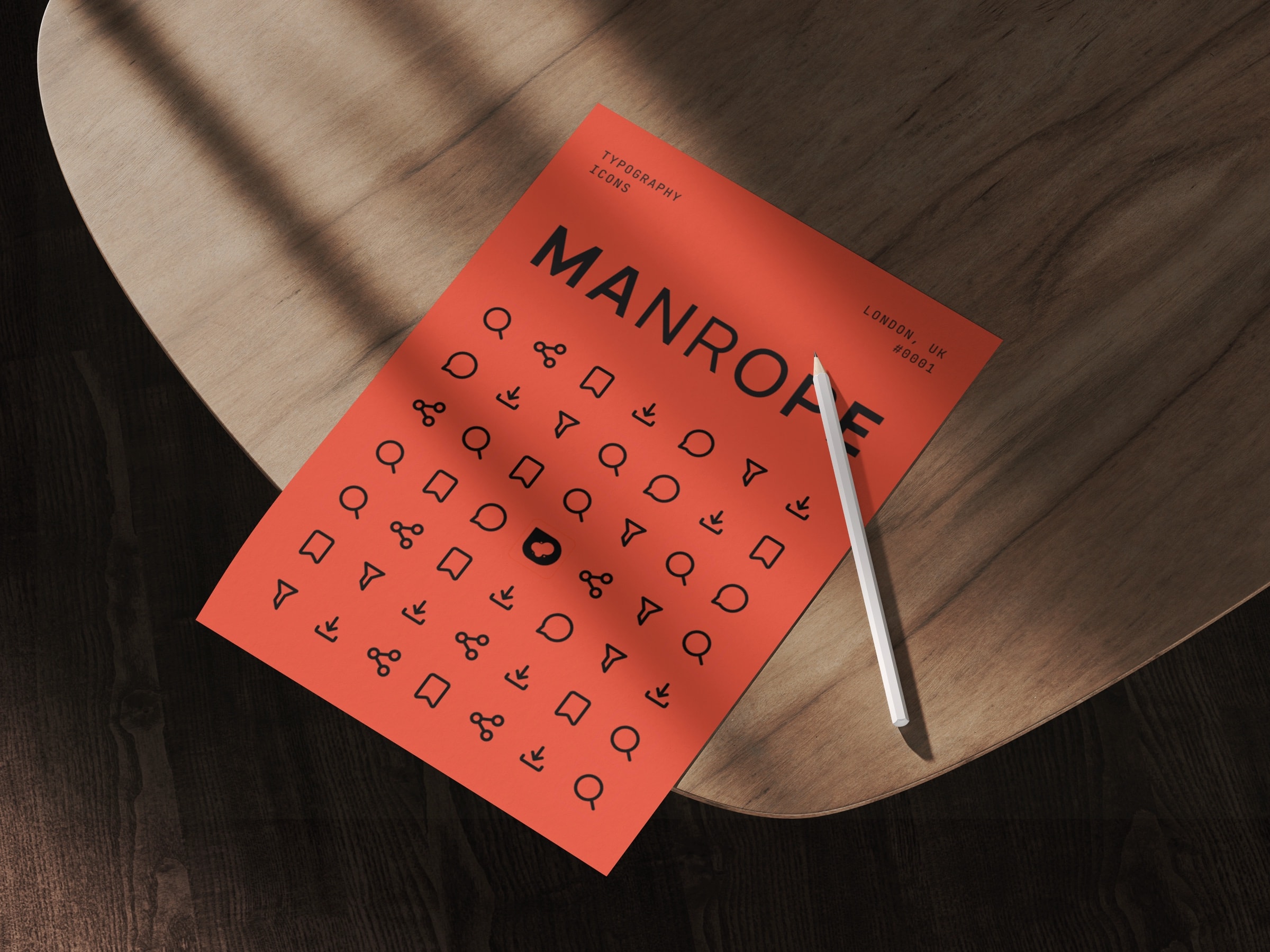
Manrope
ABCDEFGHIJKLMNOPQRSTUVWXYZ
abcdefghijklmnopqrstuvwxyz
0123456789
Manrope carries every heading, number and lockup. Inter does body and interface. JetBrains Mono takes anything that has to line up in a column.
Icons
20 glyphs cover all 3 surfaces. Every one sits in the same 24 box, on 2 stroke weights, and inherits the colour of whatever it sits in.
Logo making process
Session 1
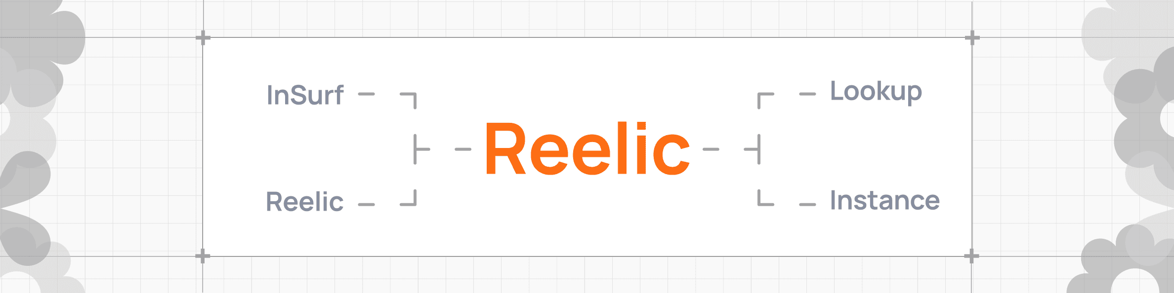
Iterated the name options to find the one that suits it best.
Outcome
What changed, and what is next
It shipped. That was the point.
Live at version 1.0.5, in 6 browsers, about 2 weeks from empty folder to installable. It has also been live for weeks with about 10 users, because I built the product before I built any way to find it.
- Shipped
- v1.0.5
- Browsers
- 6
- Surfaces
- 3
- Search
- Offline
- Data
- On device
- Built
- Solo
Chrome Web Store
Chrome, Edge, Brave, Arc, Opera, Vivaldi
In page, side panel, dashboard
Fuzzy, weighted, 4 fields
No account, no upload
Design and code, start to store
After it shipped
Pain points tracked in public and ranked by vote, so the problem people feel most is built next. It runs on the support board.
Interactive Product Experience
Welcome. Add any problem you ran into.
Open
Nothing is submitted from here. Requests clear on refresh.
What gets measured from the announcement
User
- Installs that finish the first sync
- Searches per person per week
- Still searching after 7 days
Business
- Listing views that become installs
- Uninstalls inside the first 7 days
- Requests and votes on the support board
15
Reflection and next steps
What I'd carry forward
01
Build the way in too
About 10 people use it because I built the product before any way to find it.
02
Start where the problem is
The dashboard came first and was the wrong start. The bar on Instagram is the product.
03
Show the slow part
The first sync is the first impression. Being honest about it beat hiding it.
Next steps
- 01Announce it, then read the metrics named above.
- 02Run a usability study with the beta testers to replace this review.
- 03Close the 4 heuristics that are only partly met.
It takes one click and no account.
Try it
Great products happen when the right people meet.
Let's work together